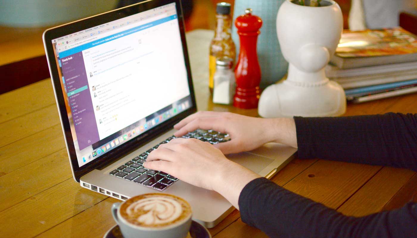
How to convert website traffic into bookings
![]()
Wondering how to get your website to the next level? Lost on how to convert website traffic into bookings? You might want to take a look at these four Timely customers.
We’ve got some amazing customers (5,536 as of today, to be exact) doing amazing things, so this list was pretty hard to narrow down! But here are four websites that can offer some inspiration; they all feature slick design, clear navigation and are rocking the booking button options. They each offer a great lesson on how to convert website traffic into bookings, which is the ultimate goal of your website, after all! They all take a different approach, so dive in and see which one works for you.
Make it easy for customers to book
Brotherhood is a barbershop in Takapuna, Auckland. Their website design is just gorgeous (hello, AMG Design!) which makes it a pleasure to visit.
The background image takes up the entire browsing window. The stylist’s tattoo and the crisp, sharp haircut on the client establish Brotherhood’s vibe right away: you can expect to receive a skilled styling experience in a modern barbershop with some personality.
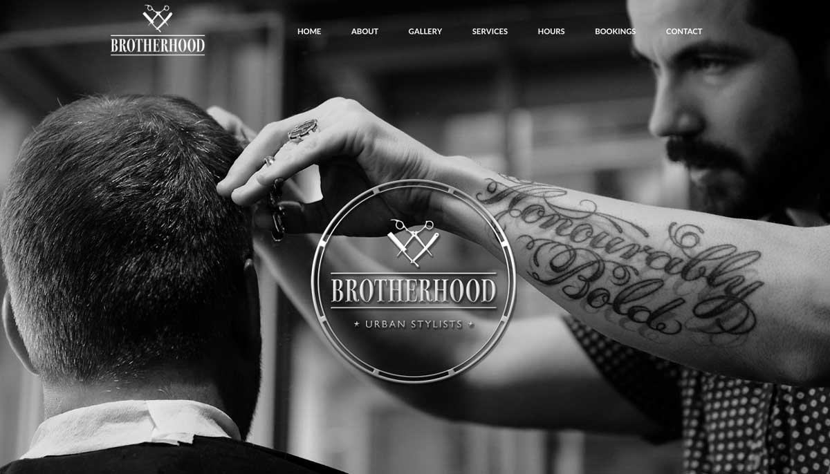
Something we love about this website is that they have the Timely booking button on nearly every single page. You can click Bookings from the home page. You can book from the About page. You can book from the Services page. You can book from the Hours page. They make it as easy as possible for clients to take the plunge and book. Well done Brotherhood!
Keep your booking buttons in plain sight
The Little Mountain Spa in Morzine, France, takes a different approach than Brotherhood – you’ll find nary an image on their home page! And yet, it’s still really clear and easy to find everything you might need.
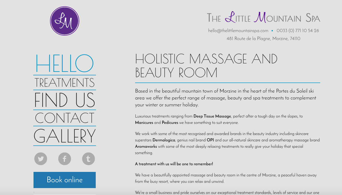
Their contact information is large and top of the home page. Half of the page is taken up by their About information (which they’ve named Hello). As soon as you get to their website, you know what they have to offer. Best of all, the sidebar navigation is big and clearly named. Clear naming conventions are really underrated, but they’re so important!
Little Mountain Spa has a pretty detailed drop-down menu under Treatments. That means customers won’t have to click in and out of different categories, trying to find the treatment they’re looking for. You might know why you’ve classified massages under Spa and facials under Beauty, but will your customers know? Try to organize your navigation so that a stranger will be able to find everything they need without having to learn your classification system.
Again, they have a large Timely booking button underneath the navigation. And because the navigation bar stays the same no matter what page you’re on, customers can book from anywhere on the website. Well done Little Mountain Spa!
Use your buttons to upsell
Les Petits Peignes in Geneva, Switzerland combines aspects of Brotherhood and The Little Mountain Spa without getting messy. They reserve the left-hand side of the page exclusively for navigation, which is clear and simple, with a prominent booking button.
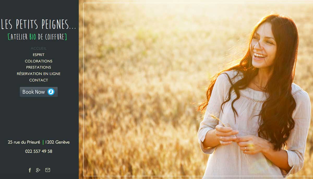
Just like The Little Mountain Spa, the navigation sidebar stay consistent as people browse the website, so customers can click the booking button from wherever they are.
Instead of having a Gallery tab, Les Petits Peignes use the rest of their home page as a carousel of gorgeous, high quality images. The images all have a similar feel – spontaneous, natural, uninhibited – and appeal to a certain type of customer, presumably their ideal customer. Anyone who likes the idea of frolicking through meadows will be hooked by this home page (we are FOR SURE up for some frolicking in Switzerland, please take us with you).
Les Petits Peignes also makes use of another great Timely feature: the gift voucher button! It appears on the Prestations page (Services in English).
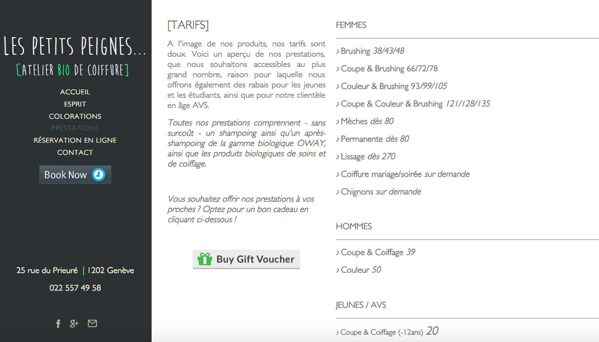
It’s a smart place to put it. Someone wishing to buy a gift will look at this page to see 1) what they can buy and 2) how much it will be. Why make them call or click away to make the actual purchase?
Plus, if a customer is looking up the services/pricing list for themselves and sees the gift voucher button on the page, it plants the seed of an idea. Perhaps the next time they’re scrambling for a unique gift idea, they will think of Les Petits Peignes. It’s a small button, but when thoughtfully placed, it can be a great benefit to a business. Well done Les Petits Peignes!
Sell more services with a widget
Miss K Beauty in Caboolture, Australia takes it to the next level with Timely booking, and we love it! The soft, clean look of their website is spot-on for beauty services.
The website manages to make use of online booking in three different ways, without seeming pushy. First up, they have an Appointments button that appears smack-dab in the center of the home page. But because it’s floating over top of the image in the background, it’s helpful instead of intrusive.
Miss K Beauty’s website uses something we haven’t seen yet in this post – the booking widget. Here’s a breakdown of widget vs. button:
- A widget embeds the booking process right onto the website’s page. Your customers can start the process from the page they’re on – they can be scrolling through the pricing list while also selecting the services they want in your widget.
- A booking button is a button that opens a lightbox over the website page after being clicked. The booking process then begins from that lightbox.
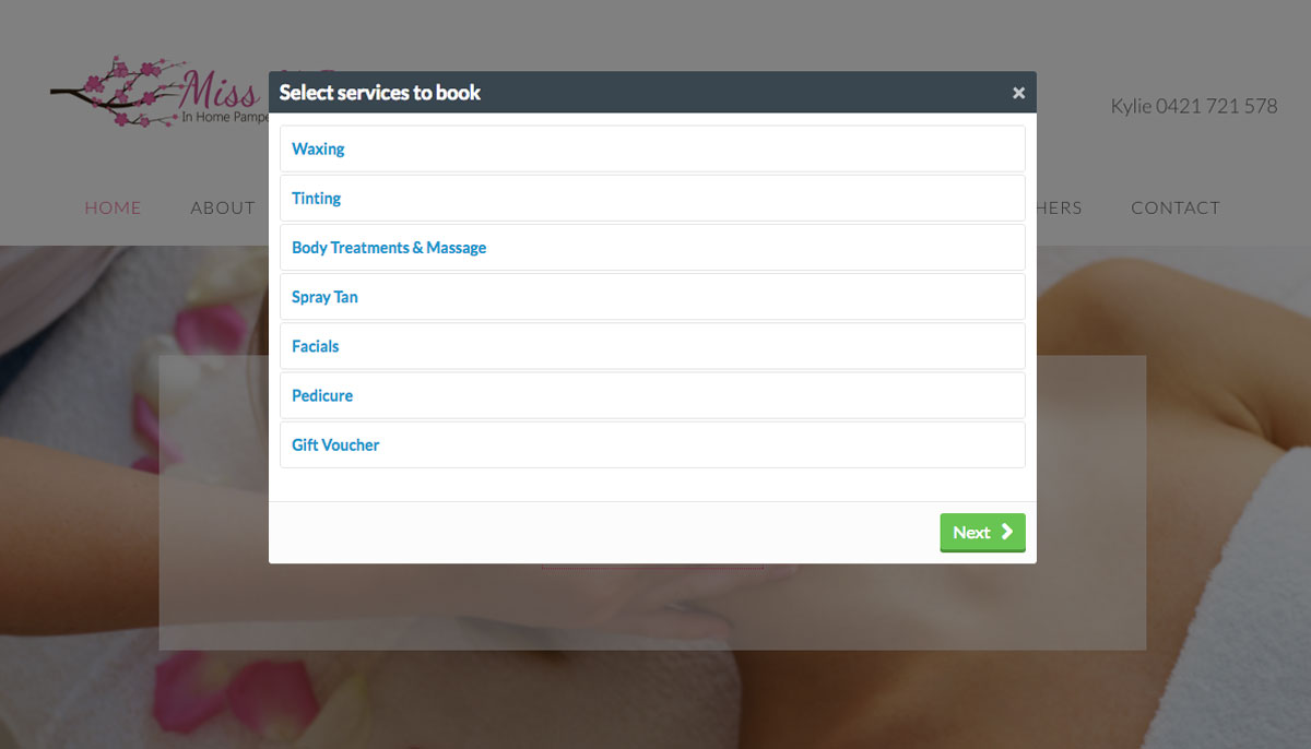
A widget is a great option, especially when it’s used on one side of the page as on Miss K Beauty’s website. It’s not taking over the customer’s browsing experience, but it’s a nice little reminder that whenever they’re ready, they can select the service they want to buy and get started.
The website also uses the standard booking button underneath or next to each service offered, again making it simple for a customer to begin booking. No scrolling back up to the top of the page, clicking appointments, then clicking again to book – it’s right next to the service you’re reading about. And if you’re looking to book multiple services instead, all you have to do is shift your eyes slightly to the right and use the booking widget. Well done Miss K Beauty!
But remember…
Although we think these websites are en fuego, not everything they do is going to work for you. No website can do everything – if you try to, it will turn into a messy, disorganized and unhelpful portal.
Before making changes to your website, write down the answers to these three questions:
- Who is your ideal customer? (check out our Perfect Client Planner if you need help with this one)
- What is your website’s goal?
- How will your changes achieve that goal and get those customers?
Once you’ve got those answers, have another browse through these superstars and see which approach resonates with you. What these websites have in common is a purpose: getting people to book your services. All of them make that as easy as possible for the customers, in ways that fit with the look and feel of their websites.
If you’ve decided that a new website or redesign of your old website isn’t on the cards this financial quarter (or year!), we’ve still got you covered. We give all our customers a mini-website when they register for Timely, just in case you need it. We’re just cool like that ;)
Interested in more tips about what makes a great website? Here’s a primer on how to start building your own. And if there’s something else you need help with, let us know in the comments!

Hey Grace, I totally agree that buttons for booking should be clearly visible and accessible. Good tips!