Hot diggity dash!
![]()
The Timely business dashboard has had a makeover, and it’s looking pretty darn good!
Now you can see how your business is performing, all in a series of beautiful charts and graphs. So it’s even easier to pinpoint areas of your business that are doing well, and areas that might need a little attention.
Let’s dive in!
Using the dashboard
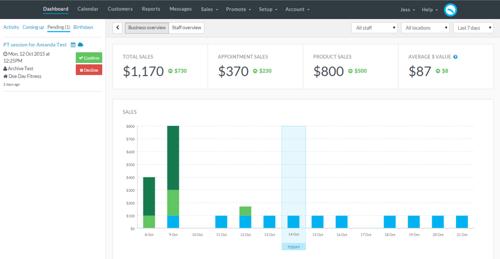
The new Dashboard is split in to three main options; Your Business Overview, Your Staff Overview and the Dashboard sidebar. The Business and Staff overviews can be filtered by date, staff and location. The coloured indicators show whether that total is up or down on the previous period.
Just click the “<” to open up the Dashboard Sidebar to view any recent Activity, accept or decline any Pending appointments and check out what’s Coming up. You can even see any customer birthday’s and send them a birthday greeting, straight from the Dashboard.
Sales performance
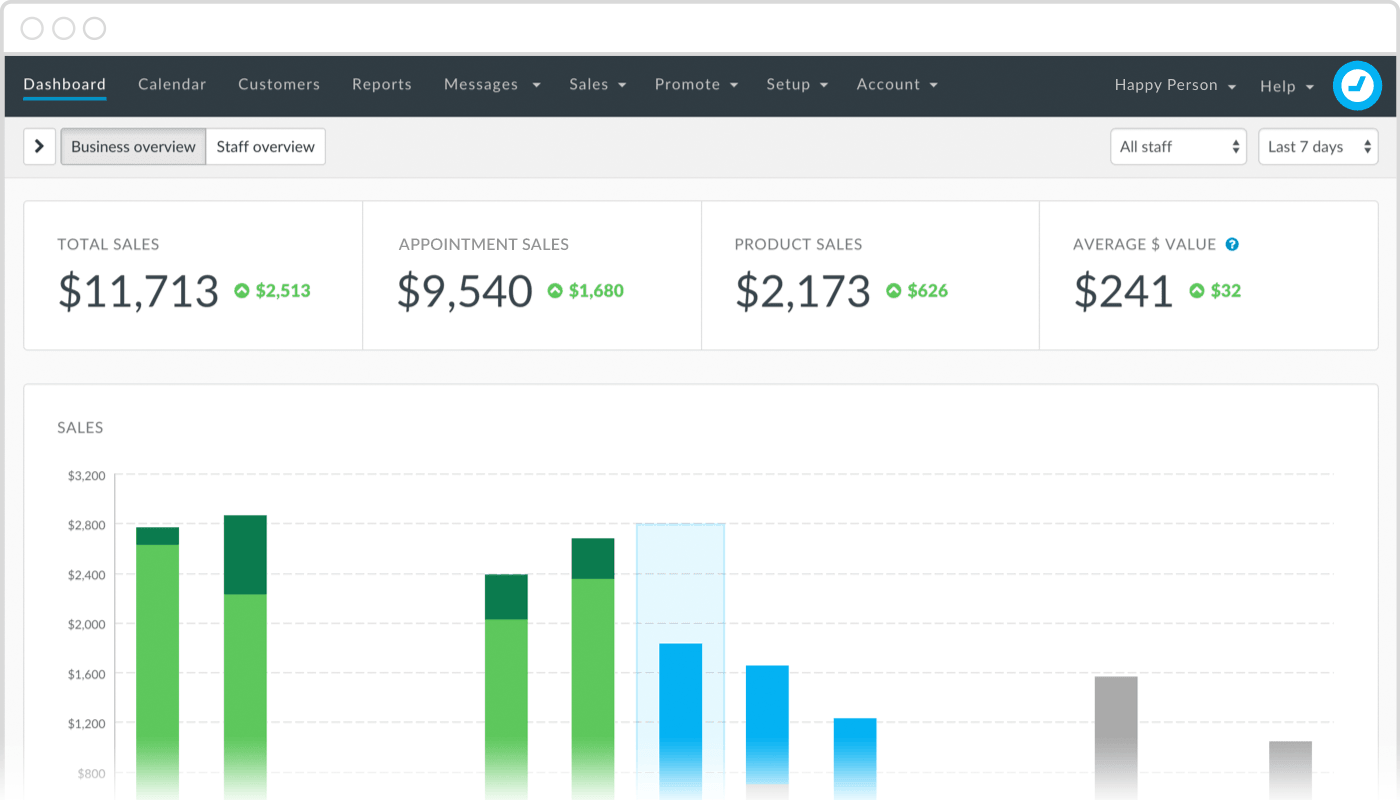
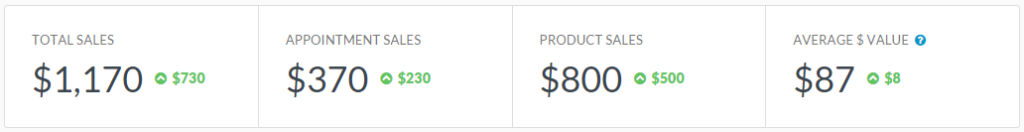
The first thing you’ll see on your shiny new dashboard is a sales summary for the period selected. This shows the Total Sales, Appointment Sales, and Product Sales, as well as the Average $ Value of your appointments. Handy change indicators show whether the total is up or down on the previous period.
If you’re a visual person and prefer graphs, the Sales performance graph shows your sales performance day by day in a nifty stacked column graph. The current day is outlined in blue.
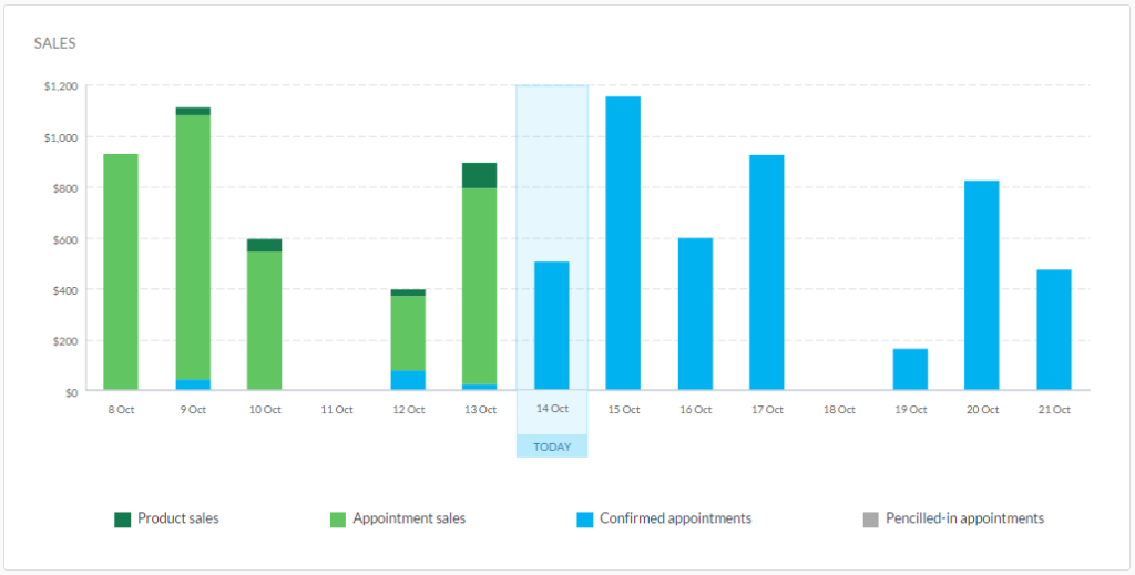
Your future value is shown using blue and grey – Appointment value shows the value of Confirmed appointments, and Pencilled-in value shows the value of appointments that are Pencilled-in.
As appointments are paid for during the course of the day, they are converted into green Service sales. Any products you sell are shown as Product sales. Simple eh!?
Customer insights and rebooking rates
The new dashboard also gives you useful customer insights, including how many customers were serviced during that period, and how many new customers walked through your doors.
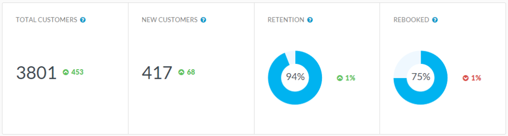
We’ve completely overhauled our Retention and Rebooking calculations, so you’ll now see a handy donut for each. Mmm donuts!
Just to recap, this is what they show:
- The Retained figure shows the percentage of customers who are returning customers, i.e, customers that you’ve seen before.
- The Rebooked figure shows what percentage of your customers have booked a future appointment in the Calendar, i.e., they have rebooked their last appointment.
Productivity
The productivity graph gives you a heads-up on how you’re spending your time by showing how much of your available time is made up of Completed, Confirmed, Pencilled-In and Did-not-show appointments.
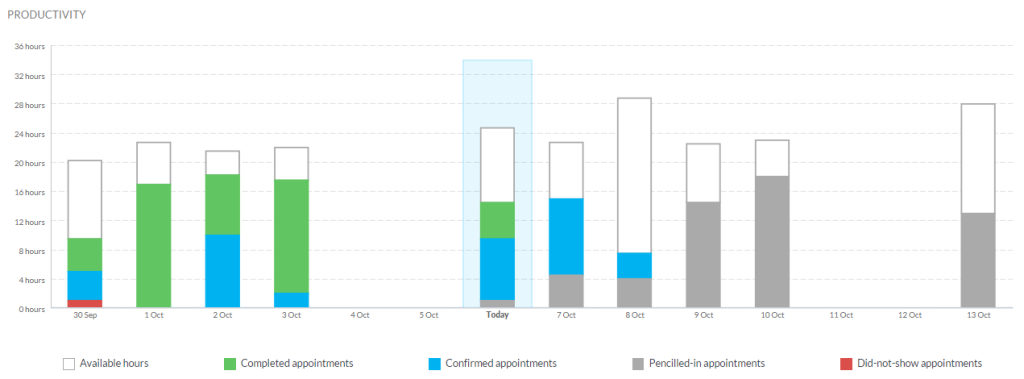
If you have a large amount of available times that are not filled, why not try these tips for getting more bookings?
Staff dashboard
The Staff overview of the dashboard allows you to see at a glance how each of your staff are performing.
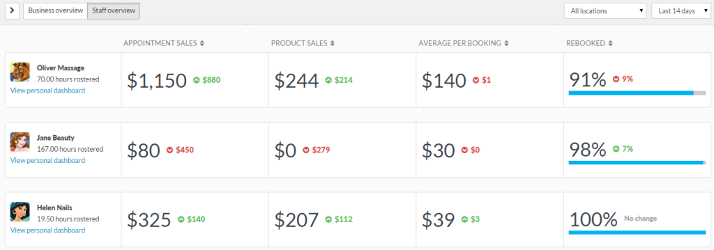
You can see the totals of your staff’s Service and Product sales, as well as the Average value per booking. Pretty nifty huh!?
You can also view a Business overview style dashboard for each of your staff by clicking View personal dashboard.
Access to the new dashboard
We’ve added some more access settings around the new dashboard too. If your staff already have access to the Dashboard in Timely, by default they will only be able to see their personal dashboard.
You can assign more access to your staff (e.g. to the Business overview) by going to Account > User access.


OMG! This just keeps getting better! Fabulous guys! Thanks
Aw shucks, thank you Jan! So glad you like it!
love it!!!!!!
Wahoo, glad to hear it Rebekah! :-)
I do like the new dashboard but have one thought. The old one showed up how many bookings were coming up, day by day. We liked that! Now it is showing dollar value but not booking numbers - which is a pity. It would be nice it we could choose to see by a. dollar value or b. appointment number (both past and future).
The old dash allowed us to see how many people had booked on any one day (we used it all the time!). Now it only shows the dollar value (curiously less interesting to us!). Would it be possible to add an option whereby we can see numbers of bookings or dollar value (both looking forwards and backwards)? Thanks.
Looks great
Thanks Seamus! :-)
What a way to go Jess! Thanks to all the Techbots this new Dashi is cool. Now just to figure out how it really works!
Wahoo thank you! Glad you like it! :-)
LOVE IT!! Will no longer need to run my reports as frequently to obtain the data I need, so thank you!!
You're welcome Kate! Glad you like it :-)
To be honest it is not useful to see past performance on a daily basis. This would be useful under a reporting tab. What is more important, as with the old dashboard, is to see the forward view of the next 30 days.
Please can we have the ability to not to see this or a way to return to the old dashboard.
Hi David, thanks for your feedback! Have you checked out the Activity sidebar? This includes your Activity, what's Coming Up, any Pending appointments and customer Birthdays :-)
New dashboard is fantastic. Really like the business and employee performance views. Relevant and important data right at your visual fingertips.
Thanks for the comment Matthew! Glad you like it :-D
Hi Jess. I see some great benefits and some disadvantages. From an owner perspective, I think it's very helpful. I can get a lot of information rather quickly. From an employer standpoint, I do see some disadvantages. We use a general login for our receptionist machine. I like when our staff can see the activity, number of appointments for the day, and other items that don't necessarily pertain to the financials. For now we have this account setup to only show a personal dashboard, but it's essentially blank as she is not a practitioner. We've lost the ability to see general info without going too detailed into the financials.
Thanks for the feedback Greg! If you give your Administrator access to their personal dashboard, they should still be able to access the Activity sidebar. If you're having trouble with that flick us an email on [email protected] :-)
Mine's blank?
Hi Catherine, flick us an email on [email protected] so we can help :-)
All looks very pretty but what is important to us is what is happening in the NEXT 7 day and NEXT 30 days more than what has happened in the past. Can we please get this ability back in the dashboard.
Hi Alice, thanks for your feedback! Activity now sits in the Activity sidebar, so you can see what's coming up :-)
Love the dashboard. Only one tiny niggle. My staff are commission based and would love to see, when they're logged in, their totals running from the first day of the week/month. They are only interested in what they've taken from the Monday of this week.
Hi Kevin, thanks for your comment! :-) I've passed your feedback on to the Techbots who are looking at making some tweaks to the Dashboard based on feedback :-D
Hey Jess!
I'm so glad that Timely is consistently updating and moving forward, however, as a business that operates using a separate POS system (Vend) for transactions to be able to swipe CC in store, I think it's much less helpful to focus on financials as the main component of the dashboard, with activity being relegated to the sidebar with no high level / managerial / broad overview functions.
EVERYONE uses Timely for booking, however, many customers do not use the limited POS functions that make the new focus on financials relevant. I feel that you are tailoring to that customer base that is utilizing Timely's limited invoice functionality.
With these changes, my dashboard now says $0 sales all of the time in the business overview and renders the staff overview completely useless.
As an owner and manager of the business, it is much more relevant for me to see lots of data concerning our activity coming up so I can plan/staff accordingly. - Confirmed appointments for the next week/month, No Shows for the previous week/month, appointments by practitioners per month.
This along with your update of the retention and rebooking (which is great) would be a nice option once in the dashboard - (to focus on activity rather than $) - this i also relevant when you have reception that does not need to see how much money is being made - the focus day to day should be an appointments and workflow, not money.
Sorry to be a downer, just looking to have a dashboard that helps with day to day efficiency!
Ryan
Hi Ryan, thanks for your honest feedback! :-) We've been reviewing all the feedback we've received on the Dashboard and we're going to be making some tweaks and changes to it over the coming weeks/months so keep your eyes peeled! :D
Hi whilst I like the new dashboard my concern is my staff can all my financial info when they login..
I don't really want them to have access to this information as its none of their business .
How can I stop this information being available to them outside of work hours??
Thanks
Ally
Thanks for your comment, Ally!
Fair enough, we can appreciate that you wouldn't want your staff to see all of that information.
You can choose which areas of the Dashboard your customers have access to under Account > Staff Access.
If you don't want them to see any of the sales information, then make sure to remove their access to "Business Dashboard" and "Personal Dashboard" (if desired).
Give us a buzz on [email protected] if we can help with getting that sorted :-D